
Big Little Details
Details, little and big, can make a kitchen. Or break it.
A kitchen needs to be functional, of course. But it also needs to feel right for the homeowner.
Most people renovate fewer than two kitchens in their lifetime. Kitchen designers like me (with decades of experience) have designed hundreds. So while we are experts at making a kitchen more functional, we also know how to use details to make the space feel right. These are some of the principles that I also consider when designing a space.
The right balance
One client I had fell in love with tis day of the dead tile and wanted to use it in her backsplash. But if we used it too much it would be overkill. So we used it sparingly (at the four corners of the window). Then we made the rest of the tiles coordinate, but be subordinate.
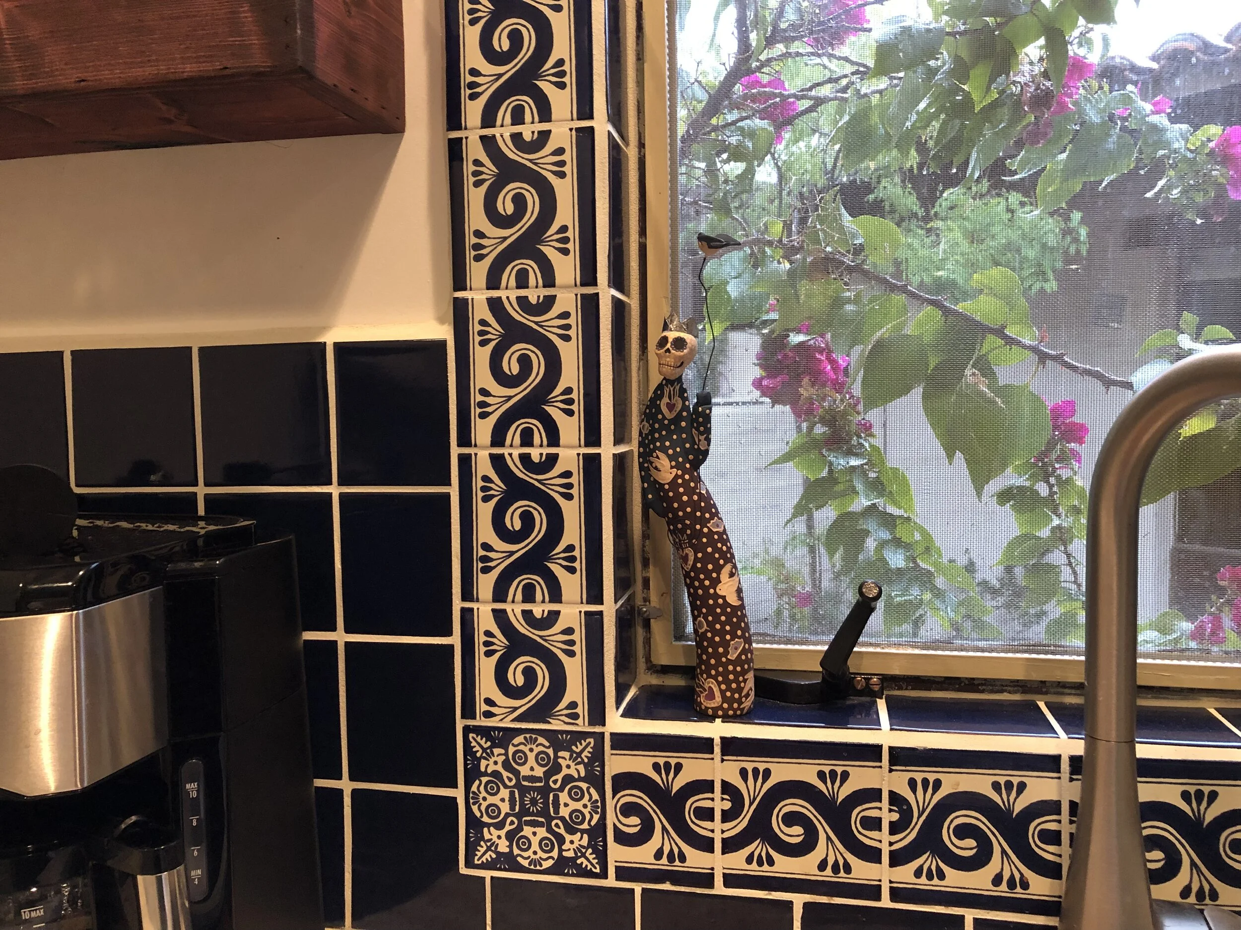
Using this tile around the entire window, let alone as the entire backsplash, would be too much. As it is, it becomes a subtle focal point—it’s perfect. I love this.
I also have a good friend who (without consulting with me or any other designer) renovated her kitchen with a countertop slab that she loved and a backsplash tile that she also loved. Their colors almost, but not quite, coordinated; their patterns — a multicolored glass backsplash and a quartz countertop with lots of movement — actively clashed. To add to these problems, neither product looked good with the existing cabinets (they were muted, it was warm). A good designer would have made certain that all of the products worked together within the space. (And, yes, the friend did quickly realize that she had made a mistake and she made the costly decision to rip all of it out and start again. Ouch.)
Here is another example of how detail can make a space. We chose a really beautiful green granite for this kitchen, but we felt it would be too boring to use it “as is” for the perimeter counter, the backsplash, and the island. So while we used this granite for all three areas, we added interest with a living edge on the island and bevel-edge tiles (created from the excess, throw-away slab material) for the backsplash. One element, used three ways, gives interest without losing the “Zen” feeling that the clients wanted.
Turning a minus into a plus
This was originally a windowless, white painted pantry at the back of a kitchen. It was open to the kitchen and was in a direct line-of-sight from the family room so was constantly on view. The homeowners wanted suggestions on how to hide it from view.

Rather than hide it, we decided to make this pantry the focal point of the kitchen. In going with the Mediterranean feel of the house, we arched a window at the back of the pantry and matched it with an arched door. We envisioned a tiled Moroccan room, but decided to save money with a similarly patterned wallpaper that gave it the same feel.
Best, her new favorite space for reading cookbooks is sitting on the table right under this window.
We also found a piece of furniture at a consignment shop—which we refinished—for the back wall to provide additional storage and complement the Mediterranean look.

The clients got their wishes for a better view and more storage, and the project stayed well within budget.
Creating focal points
Every kitchen should have at least one focal point: a glass cabinet, a beautiful hood, the countertop or backsplash material, a clad refrigerator made to look like an armoire, a pot rack or beautiful light, or even a window or a view. And in today’s open kitchens, it’s important that views seen from afar or from other rooms are planned for aesthetics as well as function. (As in the above example.)
A kitchen without a focal point is boring.

I was brought in at the end of this project after the client decided that the design of her new kitchen was good, but not great. It lacked a focal point, and it lacked life.
After looking at the entire space, including the adjoining rooms, I realized we could knock through the north wall and therefore open the living room’s fireplace into the kitchen. Since that area would have allowed only a shallow cabinet anyway, we gave up very little space for a great focal point. As an added plus, it gave a real feeling of space to the room.
Proportion and open space
Many big-box design stores try to fit in as many cabinets as possible into a kitchen. Almost always a mistake. A good designer can assist with using proportion and space appropriately, such as…
Determining the height of wall and tall cabinets in relation to the ceiling (especially important with tall ceilings)
Toning down the visual space of a refrigerator or a large island
Replacing a boring 4” backsplash and maybe varying the traditional height of the countertop
Maximizing storage space while still allowing some open wall space
At a minimum, if possible, leave at least 2” of space between cabinets and any windows
Many designers eliminate most or all wall cabinets, instead using more functional base cabinets
Shelving and glass-front cabinets also give the feel of openness while still providing storage
This display incorporates all of the tenets of proportion, coordination, focal point, and turning a minus into a plus: the big little details.

The refrigerator/freezer armoire is huge, especially with the columns to the side and the cabinets above, but it is both minimized and emphasized by painting just the door panels with a gentle fleur-de-lis pattern. The space also needed the dark red open cabinet above a farmhouse sink to give both a balance to the large armoire and an openness to the space. And the space has beautifully coordinated—but not boring—colors and textures to make this a truly beautiful display of design. (Note, this was created for a SubZero showroom when I worked at Christopher Peacock Cabinetry in Palm Beach.)
And, finally, the installer
People often balk at the price of cabinets, especially the installation. I can tell you, please, pay for the best carpenter/installer you can afford and you will be rewarded with a smoother process; accessories and moldings that are installed correctly; plumb, square, and level cabinets; and wall cabinets that don’t fall off in a few years. The cost over the life of your kitchen will be considerably less than having to correct the problems of a cheap installation. On top of all of that, the big little details that a great installer adds provides a subtle but noticeable feeling of richness to the kitchen.